{ Christmas 2007 }

Stamp Sets: Warm Words Paper: Very Vanilla, Always Artichoke and Holiday Harmony DSP (retired) Ink: Basic Black Accessories: Pomegranate Double Stitched Grosgrain, Cuttlebug "Snowflake" Embossing Folder, Round Tab Punch & Non-SU! Rhinestone Bling

As promised, here are my cards for Christmas this year. They were inspired by Kim Muhl's card, seen here. Since I procrastinated again this year, I only had time to make cards for our closest family and friends. I think I only did 30.

Anyway, sorry not much chatter, but I've been working away like Santa in his workshop. I cranked out 16 of those nugget jars that I showed you previously, so those are done, but I have LOTS more to do!

Enjoy!

{ Nugget Tin Alternative! }


Well, I promised more and here it is! This is my big idea for the season! Everyone (including me!) has been going crazy over the nugget tins. They are so cute and affordable for gifts this holiday season! But, since I couldn't find the coveted nugget tins in stock anywhere, I started brainstorming for other ideas. I know a lot of people are making their own boxes from cardstock, but I just knew that I wouldn't take the time to do those. So, I came up with this! Anyway, I used Papertrey Ink's "Holiday Treats" stamp set, Real Red and Always Artichoke papers, some dotted red organdy from Michael's, my Nestabilities, scallop punch from SU! and the two large circle punches from SU! I was able to fit 27 nuggets into this pint sized mason jar. I am so thrilled with the way that they came out! :D

Enjoy!


EDITED TO ADD:
After I played with these jars a bit more, I came up with this design, which I like WAY more! Hope you do too! :D

{ Another Scrapbook! }

Yes, yes, I know, I know, I disappeared again! I'm sorry. This have been CRAZY around here. After Thanksgiving, I was exhausted, but had to start Christmas shopping and gift-making. I think I might have bit off a tad more than I can chew with the gift making, but I'm doing it anyway! I am making large gifts for 3 people, a handful of smaller gifts and 30 Christmas cards (I'll show them soon). Plus, my Mom's and Hubby's birthdays are this month too! Yes, I have been busy and will continue to be, so please bear with me while I take a step back from blogging to do A LOT of crafting. However, think positive! I promise to share all the gifts with you as they get finished! On that note, let me show you what I made for my Mom's birthday. It is yet another 8x8 scrapbook! I am on such a roll with these! I won't drag it out like I did last time since I just don't have the time (and I'm betting you don't either!). I used the "Just Delightful" Simply Scrappin' Kit from last year's Stampin' Up!'s Sale-a-bration. I had about 1 and a half kits that I used here, plus random embellishments (Papertrey's Velvet "Air" Blossoms and White Sheer Blossoms, SU!'s Pretties Kit, unknown company's rhinestones and various ribbon) and some extra solid color SU! cardstock.


Enjoy!

{ Enchante Name Frame }


Stamp Set: Headline and Rough Edges Alpha Ink: Old Olive Paper: Enchante and Whisper White Accesories: Old Olive Wide Grosgrain, Non-SU! Pearl Brads, Pewter Hodgepodge and Silver Narrow Organdy

My girlfriend had a birthday a little while ago and this was her gift. I hoped that she would like it, but I wasn't sure if was her style or would go with the decor in her house. I had been there once, but couldn't really remember what colors were there. Does that ever happen to you? Anyway, it worked out well. She loved it, it worked well with her decor and all was well! I just love it when everything works out the way you hope!
Enjoy!

{ Gift Scrapbook 9 }


I've been totally slacking in the blogging department, huh? I felt so bad that I decided to just go ahead and post the last few pages for your enjoyment! Sorry about the delay, I've totally gotten taken into the holiday craziness! I have been brainstorming/searching for Christmas gifts and planning my Thanksgiving dinner. This is only the second year that I have hosted Thanksgiving and this will be the first year that I will make a turkey myself! The first year I was so intimidated that I purchased a turkey that was already cooked and ready to go. I figured out that to buy a cooked 11 pound turkey would be about $65 or I could by a frozen 10 pound one for a bit over $3 (after a $2 coupon), a roasting pan for $67, a nice digital thermometer for $20 and some string for $4. I figure if I just make one more turkey (or chicken, or whatever), with that the pan, then the pan and thermometer will pay for itself! I'm actually pretty excited because I LOVE turkey. Thanksgiving has always be my favorite holiday. You don't have to worry about gifts or a lot of decorations or dressing really nice - it's just food, family, friends, comfy (loose!) clothing and good conversation. I'm so excited! I better start searching for some good and healthy recipes. Anyone have any good ones they want to share?

{ Gift Scrapbook 8 }


This is another layout that I really like. These Simply Scrappin' Kits just make everything TOO easy! I *love* it! Everything is so perfectly coordinated and there are so many elements to work with. Is it terrible that I mostly love it because it requires minimal thinking? I guess I'm a lazy scrapper ... or maybe it's because this was my first real go at a true scrapbook. Well, whatever the reason is, I am so happy with it and will be doing more! :D

Enjoy!

{ Gift Scrapbook 7 }


I just LOVE this layout. I found it from one of the worksheets from the Stampin' Up demo website. It was intended for a 6x6, but I just made some adjustments for the 8x8. I just love the bursts of that lovely Guava color!

Enjoy!

{ Gift Scrapbook 6 }


I'm not really in a talkative mood today, so here is your sixth installment.

Enjoy!

{ Gift Scrapbook 5 }


I think that everything I make has a bit of SU's "Chocolate Chip" in it. Something about black, and even grey, is a bit harsh to me, so I usually go with brown. Well, this project is no different! The new Basic Grey is the "neutral" color included in this pack, but since I don't have any paper in that color, I used the Chocolate in a couple places. I think it looks really nice with the Olive and Guava in this layout. Speaking of olives, guavas and chocolate, I'm hungry! hahaha
Enjoy!

{ Gift Scrapbook 4 }


This layout was my husband's favorite. Funny, because it is not one of my favorites. I mean, don't get me wrong, I really like it, but I think it is lacking in the color department. I tried to fit another color or two in this layout, especially since all the others have at least 3 colors, but when I tried, nothing looked right! I figured that it was better to stick with simple and pretty than to try too hard doing something fancy and make it ugly! I go through that with cards sometimes too. Like, I feel like they are missing something, but I stick with simple. Now that I think about it, I do it with my clothes too ... hahaha. Maybe that just IS my style! *wink*

Enjoy!

{ Gift Scrapbook 3 }


Oh, I just love this kit! I think that there is something that is so elegant and sophisticated about it. These papers are just so luxurious! I hope that they keep this kit in the new Catalog! And how adorable are those half pearls from the Pretties Kit? I can see myself using those A LOT!

Enjoy!

{ Gift Scrapbook 2 }


Here is pages 2 & 3 of the album. Pretty straight forward here ... but please note that BEAUTIFUL hat pin on the right. I bought the Pretties kit especially to use for this project, and I've got to tell you, it is SO much better than I could have imagined! I just adore all the pretty little pieces, but I have to admit that the hat pins are my favorite. They are just TOO pretty! It was hard to force myself to use one, ya know, rather than hoarding them as all us crafters tend to do! But, I told myself it is only 1 out of 10 and I can always buy more!

Well ... at least, I hope!

Enjoy!

{ Gift Scrapbook 1 }


Well, I guess I'm going to do another marathon grouping share! My MIL birthday is later this week, so I've been working on an 8x8 scrapbook. She does bridal alterations for a living, so I thought it might be nice for her to fill this with their pictures to show to potential clients or to show them while they wait. Well, that's what I thought, but she may want to use it for something else!

I must admit that I'm not much of scrapbooker. I have a still-not-completed album that I was making of hubby and my courtship days, I have yet to even THINK about our wedding album, and I have purchased, but not yet started (nearly a year later) a scrapbook for my niece. I should say that all the above mentioned albums are to be 12x12. Although I like that size best for the amount of space it offers for pictures, I must admit that a space that large intimidates me! Keep in mind that I usually work with a space of 4.5x5.5, so when you nearly triple that, it can be very intimidating. I like it all in theory just fine, but in reality, it is just so hard! Do any other card makers out there feel like that? Well, anyway, I think the 8x8 size is less intimidating, and with only one nice big focal image, it makes designing layouts a little easier for me.

Anyway, on to the album! I'm not going to post details on the bottom because you would see all the same things over and over. So, I'll list it right here once - I used the "Secret Garden" Simply Scrappin' Kit from SU! for the bulk of this album, I supplimented with the Pretties Kit, plain silver brads, various SU! ribbon, some extra textured paper from SU!, a few sheets of SU's Au Chocolate retired paper, a few sheets from the Groovy Guava Prints Designer Paper, and some of the new velvet and vellum flowers from Papertrey. The few stamped words (on the tags) were from Fancy Flexible Phrases (retired). I have to admit that it is so much more elegant and beautiful than I had thought. There was a lot of buzz over on SCS when the prices of the SS Kits when from $12.95 to $19.95. I have to say that there are NO complaints from me! The double sided paper is GREAT. I was able to use 1 sheet for two layouts - I just decorated both sides of one sheet! And the textured paper is oh so yummy and luxurious. I love it! This kit also goes quite nicely with our Pretties Kit, also very elegant and sophisticated. Oh, and as a bonus, I thought I'd show you the cover of this album - how perfect is it? I found it at Michael's and it is EXACTLY the same as SU's old olive! Plus, I think that the pattern on goes with the SS Kit very well.

{ New Toy }

I got a new toy! And, it's not even a stamping related one! My father surprised me and sent me an iPod Nano! I was very surprised. He sent me a silver one, but I had to take it and exchange it for a red one. Red is, after all, my favorite color! Plus, part of the proceeds go to AIDS research, so it is an all around win-win situation! :D I have to admit that I didn't want one at all, but I am starting to become quite fond of this little thing. I just wasn't into the whole iPod thing, my husband has one and I could use it whenever I wanted, but I just never did. I think the appeal of this new version is the video. I like being able to have pictures on there to whip out and show people. It's mostly filled with pictures of my adorable little niece! Oh, she is just TOO cute!

Anyway, I made an observation when looking at the colors. I mean, I knew that I wanted red, but I had to check the others out too, and you know what? Apple is using SU! colors! Yes! I'm serious. This new model's "red" isn't a true red like the previous one (and I know because my hubby got that one). The previous red Nano was a yummy metallic red. This one is more pinky-purple - it's a dead-on match to SU!'s Purely Pomegranate (so much so that I named it that!)!! Their blue is SU!'s recently retired Cool Caribbean, their green is SU's long retired Mint Melody, and of course, their black is SU! Basic Black and their silver matches SU's Encore Silver ink pad! So, I guess SU! is really keeping up with the times, or are the color fads following SU!? *wink*

{ Well, Hello There! }

Sorry I haven't posted in a while. I've been working on 2 gifts and an order, so I've been stamping, just not sharing! I tried posting something yesterday, but Blogger was on the fritz so I wasn't able to, and of course, it's working now, but I don't have the photo on this computer. Oh well, I'll post either again later tonight or tomorrow. Until then ...

{ MANmade Card }

OHMIGOSH!!! This is TOO funny. You must check it out! I was rolling with laughter so badly that I had to pause it a couple times!

Click here.

{ More Luggage Tags }


I had a request to make some name luggage tags like the one that I made for my niece (seen here). Let me tell you, it was so hard to resist the urge to cover the top with ribbons. I just love the look the ribbons add, but I kept reminding myself that I had to keep them masculine.

I made the striped ones on top first. I really wanted something sophisticated and understated. I think these are more grown-up than cute, but I think that's what I like about them - that they're simple.

Anyway, while searching through my HUGE paper stash for good patterns to use, I came across the one used in the jungle ones and thought it would be *perfect* with SU's Wild About You set. And whadda know, I think I was right! The paper is a bunch of fern leaves in different colors/angles. I thought it made good jungle leaves, but my sister and husband thought it looked like camouflage, so I guess either way, it works! I am really happy with how all of these turned out, but I must admit that the jungle ones are my favorite. They're just so whimsical and cute!

Oh, and do you see the oval "ground" stamp under the lion? I read on SCS once that someone (sorry I can't remember who you are to give you credit) took some extra thin rubber off of the foam (mine was left over from my Big Blossom stamp), punched it out with her small oval punch , then mounted it on EZ mount. Quick and CHEAP "ground" stamp! :D Yea! I loved it so much that I did one with my small oval and one with my large oval punches. Now, if you decide to do this, do so at your own risk. I doubt the punches were designed to punch rubber, but I was willing to try it and my results were good, but I can't guarantee that yours will be equally successful. I definitely had to sharpen the punch with some aluminum foil after and lube it up a bit with wax paper. I've thought about doing my scalloped punches, too, but I'm a bit scared. Anyway, I think the small oval was so perfect for this little lion.

Enjoy!

{ Fruity OSW - Bag }

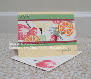
Stamp Sets: Fresh Fruits (retired) & Too Teriffic Tags (retired) Paper: Very Vanilla, Rose Red, Glorious Green & Chocolate Chip Ink: Green Galore, Always Artichoke, Rose Red, Barely Banana, Chocolate Chip, Real Red, Whisper White & Only Orange Accessories: Silver Brads, Small Tag Punch, Tag Punch & Silver Cord (retired)
Isn't this tote too cute? I got the template from Splitcoast a while back and have been using it quite a bit ever since. It is just too easy to make and too cute not to! I think it fits upto 12 cards (4.25 x 5.5) and envelopes. This is what I almost always use to keep my OSW sets. It does require stamping a few more pieces, but I love that it can make it to match the OSWs and fits them perfectly.
Enjoy!

{ Fruity OSW - 10 }

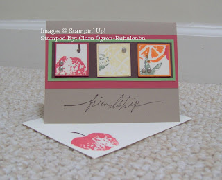
Stamp Sets: Fresh Fruits (retired) & Wonderful Words Paper: Very Vanilla, Rose Red, Glorious Green, Kraft & Chocolate Chip Ink: Green Galore, Always Artichoke, Rose Red, Barely Banana, Chocolate Chip, Real Red, Whisper White & Only Orange Accessories: Silver Brads

Okay, I'm sure you've noticed that this is the 10th card, but don't be sad just yet! My Fruity OSW group isn't over yet! These are indeed the 10 OSW cards, but I have a cute tote that I made to put these in and will show you those next! :D It wasn't included in the one stamped sheet, but it is well worth stamping a couple extra panels!

Anyway, back to this card. This layout was inspired by this one by Dawnsing over on Splitcoast. She used it for a masculine card, and I really think that it is perfect for that purpose! Besides, with the help of my trusty square punches (1 1/4" and 1 3/8"), this card was a breeze to complete! Quick, simple and cute - my favorite kind of card! ;)

Enjoy!

{ Fruity OSW - 9 }

Stamp Sets: Fresh Fruits (retired) & Small Script Paper: Very Vanilla, Rose Red, Barely Banana, Old Olive & Chocolate Chip Ink: Whisper White, Green Galore, Always Artichoke, Rose Red, Barely Banana, Chocolate Chip, Real Red, Whisper White & Only Orange Accessories: Narrow Chocolate Grosgrain, Cuttlebug "Baby" Embossing Folder & Non-SU! Rhinestone Bling

I just love this card. I love all the different layers of color and that nice centered focal point. This is a layout that I never used until I starting doing OSWs, and am so glad that I came across it! I think that it is just so cute!

Enjoy!

{ Recent Revelation }

I've come to a revelation recently and thought I would interrupt the Fruity OSW showing to share.

Ya know what I have realized? I *LOVE* vintage style sets! It's kinda funny because I really like (and mostly own) clean lined and solid style images. However, now I recognize that I also really like intricate, detailed vintage style stuff! (Especially keys ... don't know why, but I'm really drawn to key images. Weird, huh? Anyone wanna pyschoanalyze that one for me?) I'm like that in my clothes and jewelry too - I see the old fashioned stuff on other people, but I don't really know where to buy it or how to wear it, so I stick to my clean/simple/plain style stuff. (Like Jennifer Love Hewitt and her wardrobe in Ghost Whisperer – love it! If I could afford to buy one of everything she wears in that show, I absolutely would!) So, now I'm thinking I might venture out into the vintage style stamps and work my way up to a vintage wardrobe. It's easier to start with the stamps, I think … well, at least more fun! *wink*

Anyway ... you might be wondering what brought me to this epiphany. Well, through the wonderful (yet terrible-for-my-wallet) people over at Splitcoast, I've recently discovered Purple Onion Designs, Stamp Camp, Stampin' D' Amour and Art Declassified stamps (see the left hand side for links). Most of their stamps have a very vintage feel to them - and I just LOVE them! It's a good thing that my budget is sort of tied up right now, otherwise I would be buying, buying, buying!


*ahem* Hubby, you reading this? Christmas is around the corner you know ... *ahem*

{ Fruity OSW - 8 }

Stamp Sets: Fresh Fruits (retired), & Sincere Salutatins Paper: Very Vanilla, Green Galore & Only Orange Ink: Green Galore, Always Artichoke, Rose Red, Barely Banana, Chocolate Chip, Real Red, Whisper White & Only Orange Accessories: D'Vine Swirls Cuttlebug Embossing Folder, Non-SU Pearl Brad, Stardust Pen, Giga Scalloped Circle, Mega Standard Circle, Chocolate Grosgain (retired) and Tangerine Grosgrain (retired)

This is another layout that I am obsessed with, Michelle Wooderson's Tent Topper cards. I know I've discussed them here before, so I won't go into it too much, let's just say that I'm a little addicted to them. They're just so cute and easy to make! :D

I think this one is super cheery and bright, so I thought it would be perfect for a get well card.

Enjoy!

{ Fruity OSW - 7 }

Stamp Sets: Fresh Fruits (retired), Totally Tabs & Amazing to Zany Paper: Very Vanilla, Rose Red, Green Galore & Only Orange Ink: Green Galore, Always Artichoke, Rose Red, Barely Banana, Chocolate Chip, Real Red, Whisper White & Only Orange Accessories: Round Tab Punch & Stardust Glitter Pen (Non-SU!)

I'm so happy with this layout! It is just too cute! It's weird, but vertical cards are sort of a issue for me. I mean, I can make them, but for whatever reason, I just always seem to like horizontal cards better. Not this time though! I'm so happy with it. I think the scallops are adorable and I don't often use my round tab punch, but I really like it here. It was hard for me to fit a sentiment on this card, but the tab was just perfect for it!

Enjoy!

{ Fruity OSW - 6 }

Stamp Sets: Fresh Fruits (retired), Paisley Background & Print Pattern Background Paper: Very Vanilla, Rose Red, Green Galore & Only Orange Ink: Green Galore, Always Artichoke, Rose Red, Barely Banana, Chocolate Chip, Real Red, Whisper White & Only Orange Accessories: Aged Copper Hodgepodge, Rhinestone Accent (Non-SU!) and Tangerine Grosgrain (retired)

I just love this layout. I use it everytime I do a OSW. I think it makes a great blank card. I think the layout is very bold and I can just never get a sentiment to look like it fits "right" on there ... well, for me, anyway. So, this is my default blank card in my group of cards. Anyway, I'm not in much of a talking mood, so ...

Enjoy!

{ Fruity OSW - 5 }

Stamp Sets: Fresh Fruits (retired), Rough Texture Jumbo Wheel & That's Nice (retired) Paper: Very Vanilla, Rose Red, Green Galore & Chocolate Chip Ink: Green Galore, Always Artichoke, Rose Red, Barely Banana, Chocolate Chip, Real Red, Whisper White & Only Orange Accessories: Natural Hemp and Key Tag Punch

Oh this card just wouldn't photograph well (I know, I know, if I had a professional light box or a better camera, it might, right? Maybe I need to go back on what I said yesterday ;D ). Anyway, I stamped the Rough Texture jumbo wheel onto the Chocolate Chip. I think that stamp with the hemp gives this particular card a masculine touch.

Do you see the "family" poking out from the key tag hole? It is also from the retired SU! "That's Nice" set. The matchng phrase is "Other things may change, but we start and end with family." How true is that? I just love that set!

Enjoy!

{ Fruity OSW - 4 }

Stamp Sets: Fresh Fruits (retired) & Small Script (retired) Paper: Very Vanilla, Rose Red, Green Galore & Barely Banana Ink: Green Galore, Always Artichoke, Rose Red, Barely Banana, Chocolate Chip, Real Red, Whisper White & Only Orange Accessories: Silver Brads

Oh I am *loving* the way this photo came out! I think I'm finally getting the hang of card photo-taking ... well, sort-of. See, I refuse to purchase anything fancy to take good quality photos of my cards. I mean, I want photos that look nice, but do I really have to own fancy equipment to do so? Don't get me wrong, I think some the photos that others take are *gorgeous* and so professional, but I personally just don't have the patience to do it.

Anyway, here is the fourth installment of my one sheet wonder set. It's another simple one, what can I say, I'm a simple kinda gal, I guess! ;) I personally love this layout and use it often. It also makes a nice vertical card, but I usually move the trio of brads to what would be the top right side as shown here. I usually also stamp the main back layer with a background stamp, but I felt that the fruits were so bright and bold alone that the card didn't really need anything else, ya know?

Enjoy!

{ Fruity OSW - 3 }

Stamp Sets: Fresh Fruits (retired), Polka Dot Background & That's Nice (retired) Paper: Very Vanilla, Rose Red, Green Galore & Barely Banana Ink: Green Galore, Always Artichoke, Rose Red, Barely Banana, Chocolate Chip, Real Red, Whisper White & Only Orange

Here's another simple one. I didn't realize until after I stamped it, but I think the Rose Red next to the Green Galore paper together with the polka dots makes this card look like a watermelon, huh?

Do you see the sentiment at the bottom, well the coordinating inner sentiment says "A true friend says nice things behind your back." How cute is that? So far, every time I've given someone a card with that sentiment, they've just loved it. It is from the retired mini set "That's Nice." All the sayings in that set are just too cute! I *love* them! :D

Enjoy!

{ Fruity OSW - 2 }

Stamp Sets: Fresh Fruits (retired) & Wonderful Words Paper: Old Olive, Very Vanilla & Barely Banana Ink: Green Galore, Always Artichoke, Rose Red, Barely Banana, Chocolate Chip, Real Red, Whisper White & Only Orange Accessories: Ivory Wide Organdy, Copper Cord (retired) and Copper Brade (retired)


Well, here is the second card in this set of 10. Whatcha think? I know that it isn't a new layout or anything fancy, but I think it's simplicity is what makes it so elegant. I'm still sad that SU! retired the organdy ribbon and the cord. I think the two looked so good together - something about the two combined always makes me think wedding ... so, that's what this is - a wedding card! Wouldn't this be adorable attached to a cute kitchen gadget?

Enjoy!

{ Fruity OSW - 1}

Stamp Sets: Fresh Fruits (retired), In My Thoughts Paper: Old Olive, Very Vanilla, Rose Red, Barely Banana & Chocolate Chip Ink: Green Galore, Always Artichoke, Rose Red, Barely Banana, Chocolate Chip, Real Red, Whisper White & Only Orange Accessories: Pewter Jumbo Eyelet, Olive Wide Grosgrain, "Script" Cuttlebug Embossing Folder and Corner Rounder


Okay, so do you remember this post where I talked about how great One Sheet Wonders (OSW) are? Well, I have to tell you, I've made several sets since then! I just *love* them. They are so wonderful when I need to make a gift to have ready the next day. I am able to crank out 10 cards with matching envelopes and tote in one evening! I'm ashamed to say that what I really love is that it requires minimal thinking. I mean, when I need to do these, I'm not usually in my creative groove and just need to get out something but I do want it to be nice, ya know? Anyway, with the help of my new Big Shot and some newly learned layouts (thanks to Splitcoast), I think I have been able to kick these OSW cards "up a notch." I have really been wanting to use Fresh Fruits to do a OSW. I thought that the set would really lend itself well to this technique - and it did! I really think that they came out well - colorful yet sophisticated. So, over the next few days, I'll show you the complete set that I made and you can let me know if you agree! Any feedback - positive or not will be greatly appreciated! :D


Enjoy!

{ Masculine Waves }

Stamp Sets: Winds of Grace, Happy Everything & Shore Thing (retired) Paper: Very Vanilla, Night of Navy, Close to Cocoa & Always Artichoke Ink: Close to Cocoa Accessories: Aged Copper Hodgepodge & Small Oval Punch

I love this set! It really caught my eye when I first saw it in the new catty. It is masculine yet soft and looked like it would be easy to use ... and it *is* all those things!

I've had this layout rolling around in my head and couldn't wait to get it down on paper. I wanted to use a torn piece of blue in the background to give the effect of waves. When I realized that my retired "Shore Thing" stamp set even had little waves, I was so excited! I think next time I will put the greeting up a little higher though. I really wanted to use some twill or twine on this card, but I was trying to keep it real simple so it would keep that masculine feel. Masculine cards are so difficult for me (and most stampers, I think), so I'm happy to have another one to add to my collection.
Enjoy!

{ Recollections Frame }

Paper: Recollections (retired) and Cranberry Crisp (retired) Accessories: On Board Accessories, True Thyme Stitched Grosgrain (retired), Cranberry Crisp Stitched Grosgrain (retired) and Mod Podge


A couple months back someone on Splitcoast mentioned some great picture frames at the Target $1 Spot, so naturally I had to go and stock up on them. I behaved myself (kinda!) and only purchased 4. What was I thinking? ONE dollar each and I only got 4? Well, I'm sure the hubby would be proud! lol.

Anyway, I just now got around to actually altering one. I decided to use the retired Recollections paper. Actually, it is still around, just in another form. SU! brought back pretty much the same design, but everything is in shades of blue, green and yellow (It is called "Porcelain Prints," if you are interested). So, I was trying to go with an antique-y/vintage-y/worn/shabby chic type look with the rough edges, frayed ribbon, slight tears and such (you may need to enlarge the picture to see what I'm talking about), but I think - in the end - it just looked like I messed up when I was making it. lol. It looks sorta unprofessional/unfinished/amateur. Oh well. I *mostly* like it and if nothing else, shows you what *not* to do!

Enjoy!

{ Food Signs }


Paper: Barely Banana, Georgia Pacific White Ink: Whisper White Craft Accessories: Black Gingham Ribbon and "Textile" Cuttlebug Embossing Folder


Is that what these are called? Food signs? lol. I mean, they are signs for the food, right? I'm sure they have a more proper name, but I'm not sure what it is. If you know, please tell me! "Food Signs" just seems like a silly name!


Anyway, the surprise party is tonight and my sister called me yesterday and asked me to make little signs for the drinks and hors d'oeuvres. She said they they were going with some pastel yellow decor and wanted me to make something to match. These are what I came up with. I'm really happy with them. Originally, I had planned to print the labels on white paper layered on Barely Banana and then layer that onto folded white cards that had the big swirl from Baroque Motif stamped in Barely Banana onto it. But, Barely Banana being *so* light, it just didn't look right. I tried a couple different ways to make the swirl work (so it would match the invites that I talked about earlier), but I just couldn't. I then played around a bit and came up with this. I'm really happy with them. As you can tell from the picture of the full set, I rubbed a bit of Whisper White craft ink on the embossed paper to make the embossing "pop" just a bit more. It doesn't look quite that pronounced when you see them in person though. It looks more like it does in the top picture - more subtle, like a shadowing effect. Anyway, I emailed these pictures to my Sister and she was happy, I'm happy, so now it's party time! :D


Enjoy!
Related Posts with Thumbnails